
Social Media Graphics: Create Designs That Convert
Key takeaways
- Start every graphic with one audience, one message, and one action.
- Match the format to the platform and the conversion goal.
- Build reusable templates, but adapt the crop, copy, and call to action for each channel.
- Measure clicks, replies, signups, and qualified conversations, not just likes.
Social media graphics convert when they make one clear promise, show why it matters, and guide people toward one obvious action. Use strong hierarchy, readable type, platform-specific formats, accessible design, and a measurement plan to turn a visual post into a useful part of your marketing system.
That matters because graphics do more than decorate a feed. They can explain a product, answer an objection, start a conversation, or move a potential customer to your website. Treat each design as a small sales and education asset, not as an isolated image.
What Makes Social Media Graphics Engaging?
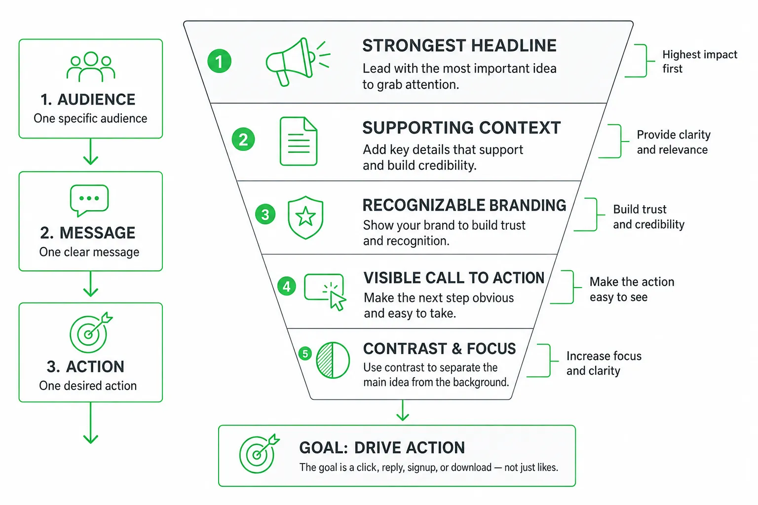
Start with one audience, one message, and one action. A graphic aimed at SaaS founders should not also speak to enterprise buyers, explain every feature, and promote three different offers. Choose the clearest job for the post.
- Audience: “Indie hackers searching for a better way to find leads.”
- Message: “Find prospects who are already asking for your solution.”
- Action: “Read the guide” or “Reply with your biggest acquisition challenge.”
Then build a visual hierarchy that works while someone scrolls. Put the strongest headline first. Follow it with supporting context, recognizable branding, and a visible call to action.
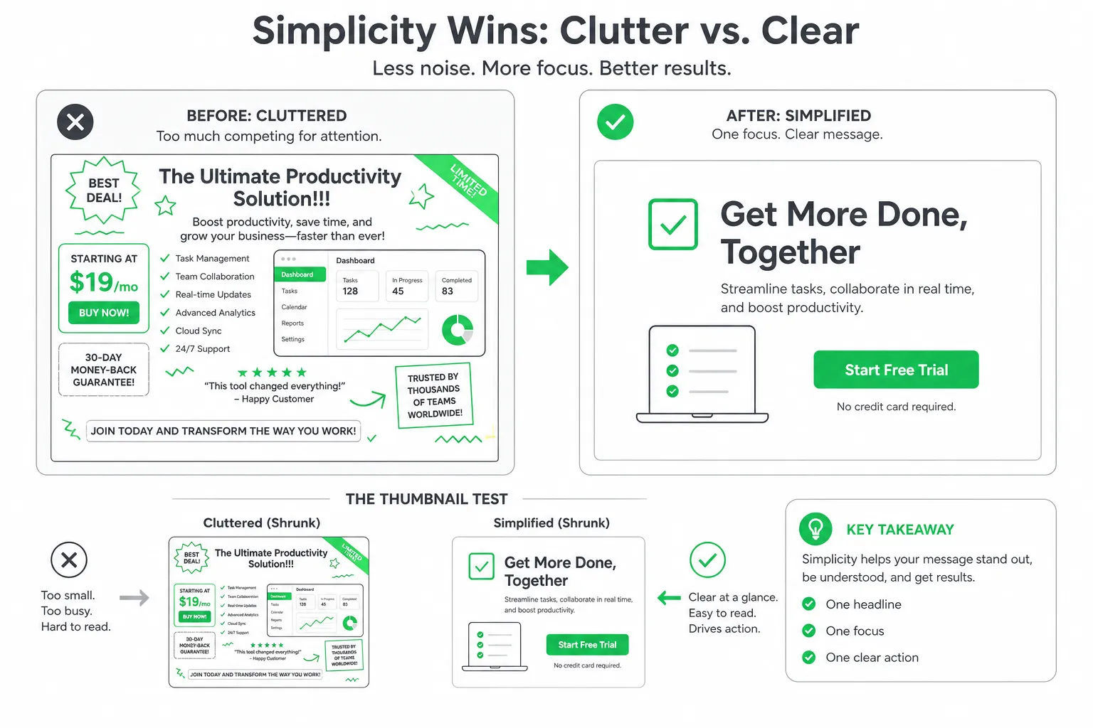
Use contrast to separate the main idea from the background. Leave enough whitespace around the headline. Choose type that remains readable on a small screen. Give the design one focal point instead of competing icons, headlines, screenshots, and decorative elements.
Images deserve strategic attention. In HubSpot’s 2025 survey, images were the second-highest-ROI content format reported by marketers behind short-form video, with 19% identifying images as a top-ROI format, according to HubSpot’s 2025 State of Marketing & Trends Report.
How to Create Social Media Graphics That Convert
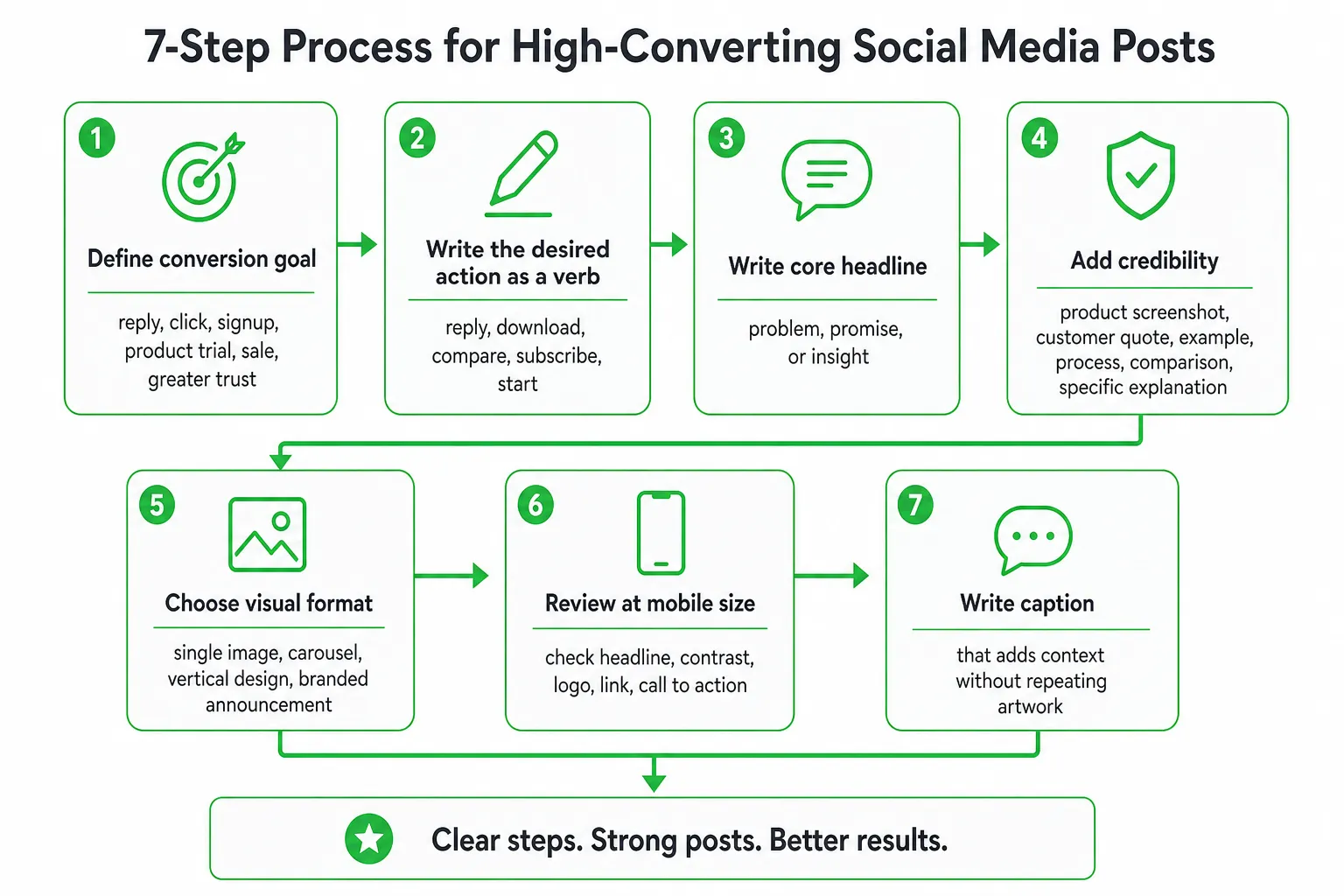
Define the conversion goal before opening a design tool. Your goal could be a reply, a click, a signup, a product trial, a sale, or greater trust. Each goal calls for a different message and call to action.
- Choose the desired action. Write it as a verb: reply, download, compare, subscribe, or start.
- Write the core headline. State the problem, promise, or insight in concise language.
- Add credibility. Use a product screenshot, customer quote, example, process, comparison, or specific explanation. Do not add proof that you cannot verify.
- Choose the visual format. Use a single image for a focused claim, a carousel for a teaching sequence, a vertical design for an update, or a branded announcement for a launch.
- Review it at mobile size. Check the headline, contrast, logo, link destination, and call to action before publishing.
- Write a caption that adds context. Do not repeat every word from the artwork. Explain the situation, provide the next detail, or invite a useful response.
For example, a product feature graphic could lead with “See every qualified Reddit conversation in one view.” A second line can explain who benefits and why. The call to action might invite readers to see the workflow rather than forcing a generic “Learn more.”
Keep the promise aligned with the destination. A graphic that offers a practical guide should lead to that guide, not a general homepage. Consistency reduces friction and makes performance easier to interpret.
Choose the Right Graphic for Each Platform
Do not publish one unchanged image everywhere and expect the same result. Adapt the composition, crop, text density, and call to action to the behavior of each network.
| Graphic type | Best use | Design direction |
|---|---|---|
| Single-image post | Focused claim, tip, or product position | Use one headline, one visual anchor, and one action. |
| Carousel | Step-by-step education or comparison | Give every panel one job and make the next swipe feel useful. |
| Vertical design | Quick updates, discovery, and immersive viewing | Use larger type, clear spacing, and a composition that survives cropping. |
| Professional visual | Credibility-led posts and business announcements | Use restrained branding, strong evidence, and a polished layout. |
Keep important text and logos away from interface overlays, cropping zones, and edges. Preview the design on a small screen before publishing. A headline hidden behind a profile element cannot do its job.
Build reusable templates for recurring content types, but leave room for the idea itself. A customer story may need a quote-led layout. A feature announcement may need a product screenshot. A comparison may need a table or split composition.
Templates should reduce production work, not make every post look identical. Preserve the visual system while adapting the message to the platform and audience.
Design Systems That Make Graphics Consistent
A design system gives your team repeatable decisions. Document the brand colors, typefaces, logo treatments, image style, illustration approach, and tone. Add rules for headlines, captions inside graphics, buttons, and calls to action.
Then create template families for the content you publish most often:
- Educational posts: Explain a process, definition, or practical lesson.
- Customer stories: Highlight the problem, approach, and result without inventing details.
- Feature launches: Show what changed and who benefits.
- Quotes: Give a useful observation enough space to breathe.
- Comparisons: Clarify the choice without overwhelming the viewer.
- Lead-generation posts: Connect a problem to a relevant next step.
- Event promotions: Make the topic, timing, and action immediately clear.
Use consistent visual cues without overpowering the content. A recurring corner treatment, color pairing, or type hierarchy can make your posts recognizable. It should support the idea, not become the idea.
Organize approved assets in a shared location. Include editable source files, final exports, logo variations, image permissions, font information, and a short checklist. This lets founders, marketers, and collaborators produce on-brand graphics without rebuilding the system each time.
Visual consistency also supports trust. Canva’s research found that 89% of surveyed business leaders said visual communication tools contribute to business ROI, according to the Canva Visual Economy Report.
The Social Media Graphics Gap: Accessibility, AI, and Small-Team Workflows
Many pages about social media graphics stop at downloadable templates, vectors, and mockups. That leaves out the decisions that determine whether a design works: what to say, where to publish it, how to make it accessible, how to connect it to a SaaS workflow, and how to learn from the results.
That gap creates an opportunity. Effective graphics require more than a polished file.
Design for accessibility
- Use sufficient color contrast between text and its background.
- Choose type that remains legible at mobile size.
- Provide descriptive alternative text where the platform supports it.
- Add captions or text summaries for motion and video-based visual content.
- Do not rely on color alone to communicate status, priority, or meaning.
- Keep the key message in the caption when the image contains essential information.
Accessibility improves clarity for everyone. It also forces you to test whether the graphic communicates an idea or merely displays decoration.
Use AI as a production assistant
AI can help you brainstorm concepts, generate headline variations, suggest layouts, organize a content calendar, and adapt a core idea for different channels. It should not replace review.
Check every AI-assisted graphic for factual accuracy, brand fit, originality, image rights, awkward typography, and misleading claims. Review generated imagery closely, especially hands, logos, interface screens, charts, and text.
Connect design to the whole workflow
For a SaaS or small-business team, the useful sequence looks like this:
- Identify a customer problem from sales calls, support questions, search demand, or public conversations.
- Turn that problem into a clear visual idea and a specific action.
- Create the graphic and platform-specific adaptations.
- Publish it where the intended audience already spends time.
- Monitor replies, objections, clicks, and qualified conversations.
- Repurpose strong ideas into a carousel, blog section, email, product explanation, or follow-up message.
Visual communication affects business performance, not just appearance. In Canva’s research, 85% of surveyed business leaders said visual communication carries more authority than other communication methods, according to the Canva Visual Economy Report.
How to Measure Whether Graphics Are Working
Match the metric to the objective. A graphic designed to teach should not be judged only by immediate clicks. A graphic designed to generate leads should not be considered successful because it received attention from people who never take the next step.
- Usefulness: Review saves and shares.
- Conversation: Track comments, replies, questions, and direct messages.
- Traffic: Measure link clicks and landing-page behavior.
- Lead generation: Track signups, form completions, and lead quality.
- Revenue support: Connect qualified conversations and assisted conversions to the original campaign where possible.
Compare variations by message, creative angle, format, audience, and call to action. Change one meaningful variable at a time when you can. A different headline may outperform a new color palette because the promise is clearer.
Use tagged links for graphics that drive traffic. Review what visitors do after the click. A high-click graphic that sends the wrong audience to a confusing page needs a better message, destination, or qualification step.
Combine analytics with qualitative feedback. Questions in comments can reveal the next topic. Objections in replies can become a comparison graphic. Repeated confusion can become a step-by-step carousel.
For broader context, Sprout Social’s 2025 benchmark study analyzed more than 3 billion messages from over 1 million public social profiles, according to The 2025 Content Benchmarks Report. Use benchmark research as context, but prioritize your own audience, offer, and conversion path.
A Practical Production Workflow for Better Results
Start with a brief. Keep it short enough to use and detailed enough to prevent rework.
- Audience: Who needs this message?
- Problem: What are they trying to solve?
- Promise: What useful outcome does the graphic communicate?
- Proof: What example, explanation, or product detail supports it?
- Platform and format: Where will it appear, and how will people view it?
- Brand requirements: Which colors, typefaces, assets, and voice rules apply?
- Accessibility checks: Is the type readable, the contrast clear, and the meaning available beyond color?
- Desired action: What should the viewer do next?
Batch related concepts so you can build a coherent series instead of isolated posts. Produce platform-specific adaptations from organized source files. Keep winning designs easy to update when the offer, screenshot, or product changes.
Add an approval step before publishing. Check claims, links, spelling, image rights, accessibility, cropping, and brand consistency. A second review can catch the small errors that weaken trust.
OneUp Today can support this workflow by turning growth ideas into AI-assisted content, publishing across multiple platforms, and connecting social activity with Reddit lead generation, SEO, and follow-up. You approve every send, keeping automation under human control.
Make Every Graphic Do One Useful Job
The strongest social media graphics are clear before they are clever. Give each design one audience, one message, and one action. Match the format to the platform, make the experience accessible, and measure what happens after the view.
Next step: Choose one recent customer question and turn it into a simple graphic brief today. Write the headline, proof point, platform, format, and call to action before you design anything.
Frequently asked questions
What is the ideal size for social media graphics on different platforms?
Yes, sizes vary by platform. For Instagram, use 1080x1080 pixels for square posts, 1080x1350 for portrait, and 1080x566 for landscape. Twitter recommends 1200x675 pixels, while LinkedIn prefers 1200x627. Always check current guidelines for updates.
How do I make social media graphics accessible for people with visual impairments?
Yes, ensure high contrast between text and background, use readable fonts at least 16px, add alt text to images, and avoid relying solely on color to convey information. Tools like WebAIM's contrast checker help meet WCAG standards.
What tools can I use to create social media graphics without design experience?
Yes, Canva, Adobe Express, and Figma offer templates and drag-and-drop interfaces. Canva is beginner-friendly with platform-specific sizes, while Figma allows more customization. All provide free tiers with basic features.
How often should I update my social media graphics templates?
Yes, update templates quarterly or when brand guidelines change. Review performance data monthly to identify low-engagement designs. Refresh colors, fonts, or layouts to align with current trends, but maintain core branding elements for consistency.
What is the best file format for social media graphics?
PNG is best for static images with text or logos due to lossless compression. JPEG works for photos but may reduce quality. Use GIF for simple animations and MP4 for video content. Avoid TIFF or BMP as they are not web-friendly.